 (77 Ratings & Reviews)
When a customer drives toward your business for the first time, a monument sign is often the first physical signal that they have arrived. These low-profile, freestanding structures sit at property entrances, parking lots, and building frontages across the Denver metro — and when they are designed well, they do more than mark a location. They communicate permanence, professionalism, and brand identity before anyone walks through the door.
At Vision Visual Signs, we design, fabricate, permit, and install monument signs for businesses across Denver, Golden, Lakewood, Arvada, and the greater Front Range. This guide covers everything you need to know before starting your project.
What Is a Monument Sign?
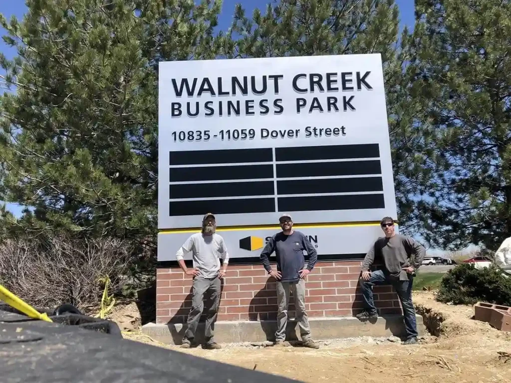
A monument sign is a freestanding, ground-level structure — typically low and wide — that stands independently without posts or poles. Unlike pole signs that rise high above a property, monument signs sit close to the ground and integrate with the landscape around them.
They are a permanent installation. Unlike banners, window vinyl, or temporary signage, a monument sign is designed to last decades. That permanence is both their main advantage and the reason the design and fabrication process deserves careful attention from the start.
Monument signs are common for corporate campuses, office parks, medical facilities, retail centers, multi-tenant properties, residential communities, churches, and schools. Any property where visitors need a clear signal at the entrance benefits from one.
Types of Monument Signs
Single-Tenant
Displays one business name or brand. Common for standalone retail locations, medical offices, and corporate buildings.
Multi-Tenant
Displays multiple tenant names, often with interchangeable panels. Standard for office parks, strip malls, and commercial complexes where tenants change over time.
Illuminated
Incorporates LED lighting — either internally lit panels, halo-lit lettering, or externally mounted fixtures — for visibility at night and during low-light conditions.
Non-Illuminated
Relies on ambient light. Works well for locations with adequate exterior lighting or where nighttime visibility is less critical.
Dimensional and Sculptural
Incorporates three-dimensional letters, logos, or design elements that add visual depth and a premium appearance. Increasingly common for medical campuses, corporate headquarters, and upscale retail.
Materials
Monument sign cabinets and bases are built from a range of materials depending on budget, aesthetic goals, and site requirements:
- Aluminum and steel: Durable, lightweight, and fully customizable. Standard for most commercial monument signs.
- High-density urethane (HDU): A foam-based material that carves and shapes like wood but resists moisture and warping. Common for dimensional and carved signs.
- Brick, stone, or masonry: Often used for the base structure when the property has existing brick or stone architecture.
- Stucco finish: Applied over a structural frame for a smooth, painted finish that matches building exteriors.
At Vision Visual Signs, we match the material recommendation to the specific property and budget. Most of our Denver-area monument sign projects combine an aluminum cabinet with a masonry or stucco base to balance durability, aesthetics, and cost.
Design Considerations
- Location and placement: A monument sign needs to be visible from the street and accessible for both pedestrians and drivers. It should not obstruct sightlines at driveways or be hidden by landscaping as plants grow.
- Size and proportions: The sign should be scaled to the property and the street. Municipal code requirements for the zone typically set maximum dimensions.
- Legibility: Keep the message simple. Business name, logo, and if needed, address. The best monument signs communicate in under three seconds at driving speed.
- Brand alignment: Colors, fonts, and finishes should match the building exterior and the overall brand identity.
- Landscaping integration: Monument signs often look best surrounded by low plantings or decorative stone. Plan for this during the design phase, not after installation.
Permitting in the Denver Area
Most municipalities in the Denver metro require a permit before installing a monument sign. Requirements vary by city, zoning district, and sign size, but typically include:
- Maximum sign height — often 6 to 8 feet for commercial zones
- Maximum sign area in square feet
- Setback requirements from the street and property lines
- Lighting restrictions in some residential-adjacent zones
- Electrical permit for illuminated signs
Denver, Golden, Lakewood, Wheat Ridge, and Arvada all have their own sign codes. Jefferson County has separate requirements for unincorporated areas. Vision Visual Signs manages the full permitting process for our clients across the Front Range. Learn more about sign permitting in Denver.
What to Look for in a Monument Sign Installer
- Experience with permanent structures: Monument signs involve excavation, concrete footings, electrical conduit, and structural anchoring. Your installer should have documented experience with ground-up installations.
- In-house design and fabrication: Working with a company that designs and builds the sign in-house gives you better quality control and faster turnaround.
- Local permitting knowledge: Sign codes vary significantly across Denver-area municipalities. Choose a company that knows your city requirements.
- Portfolio of local work: Ask to see completed monument sign projects in the Denver area. Real installations in your market are the best evidence of quality.
Vision Visual Signs is a full-service commercial sign company based in the Denver area. We handle everything from site evaluation and design through fabrication, permitting, and professional installation. View our monument sign portfolio.
Ready to Get Started? Whether you need a single-tenant monument sign for a new location or a multi-tenant directory for a commercial complex, our team is ready to help. We start with a site evaluation, walk you through design options, and handle everything from permit to installation.
View our monument sign portfolio | Request a quote
Vision Visual Signs — Custom commercial signage for Denver, Golden, Lakewood, Boulder, and the Greater Front Range. On Budget, On Time, On Spec.